
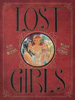
 To start with the facts, here is the beginning of the Wikipedia entry for Lost Girls: ‘Lost Girls is a graphic novel written by Alan Moore and illustrated by Melinda Gebbie, depicting the sexually explicit adventures of three female fictional characters of the late nineteenth and early twentieth century: Alice from Lewis Carroll’s Alice’s Adventures in Wonderland and Through the Looking-Glass, Dorothy Gale from L. Frank Baum’s The Wonderful Wizard of Oz, and Wendy Darling from J.M. Barrie’s Peter Pan. They meet as adults in 1913 and describe and share some of their erotic adventures with each other.’ That is all true, but hardly scratches the surface of what is one of the most exciting, erotic, thought-provoking, mind-bending graphic collaborations of recent years.
Sixteen years in the making, Lost Girls is the product of Alan Moore’s fertile intelligent imagination and Melinda Gebbie’s artistic skills and attention to graphic detail. There are inevitably some issues with continuity and historic accuracy, but there are few other works that can be read as literature, art history and social commentary while being enjoyed as a visual feast for the eyes.
There are inevitably also issues about the transgressive subject matter. Here is Steve Foxe writing about Lost Girls in the online magazine Paste: ‘It contains very nearly every kind of pornography. A handsome man first seduces a young American girl (Dorothy, formerly of Kansas) who indulges his shoe fetish before anally penetrating the older, apparently heteroflexible husband of a repressed Wendy, terribly far from her teenage Neverland. A silver-haired Alice rediscovers Wonderland as she lays a sprightly young maid with the assistance of a porcelain dildo. In one of many asides from the primary plot, a family of four engages in every conceivable combination of incest, son and daughter clearly below the teenage threshold. Most of the book, in fact, challenges obscenity laws and definitions of child pornography. Preteen brothers explore their sexuality, a young street urchin turns tricks to survive and Alice falls prey to the manipulations of a predatory white rabbit. To remove any ambiguity in the minds of those who have yet to read the book, Gebbie draws every adolescent sex act in full detail in lush crayon.’
It all depends on what you think the book’s readership is able to handle by way of erotic imagination, but there is little in Lost Girls which is not imagined with far less care and thought in material which is truly pornographic. As Allan Moore explained in a 2006 interview with Dorman Shindler, ‘I really don’t like most modern pornography, and most modern pornography is photographic. I find that I gravitate more toward illustrations or literature, and read a sampling of Victorian and Edwardian pornography which I thought was surprisingly good. It was very human, very pleasure-centred. And often you’d get quite startling chapters where, in the middle of an orgy, most of the characters suddenly break off to have a discussion about sexual morals, sexual etiquette.’
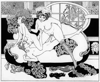
Whatever the arguments for and against its subject matter, there is very little about Melinda Gebbie’s illustrations for Lost Girls that fails to satisfy, either erotically or artistically. Perhaps the most interesting aspect of the artwork is the way she uses a variety of styles, colours and perspectives to bring a varying coherence to each of the book’s thirty chapters. In addition to her own colourful use of crayon, there are sequences which pay appropriate and brilliantly-observed homage to many of the earlier erotic artists whose work appears on this website – Franz von Bayros, Aubrey Beardsley, Gerda Wegener, Egon Schiele and Alphonse Mucha.
We have only shown a representative selection of the Lost Girls illustrations here; there are over a thousand in the book’s 240 pages!
Lost Girls is published by Top Shelf Productions; it was originally published in a boxed three-volume set, but the only version currently available to buy new is the single-volume hardback.
The Wikipedia entry for Lost Girls, which you can find here, includes a complete plot summary and several useful links to reviews and interviews with Melinda Gebbie and Alan Moore.
Here are some of Melinda Gebbie’s responses to interview questions from Ismo Santala of Ready Steady Book in November 2006.
You’ve mentioned that the initial idea for Lost Girls was partly influenced by your interest in three central female characters. Where did that interest come from?
I did a story called ‘My Three Swans’ that appeared in Young Lust, the taboo sex issue. The title was based on an old American sitcom called ‘My Three Sons’ with Fred MacMurray playing the father of these three boys, each from distinctly different ages. It’s a short story, only about four pages long, about three girls who are growing up. They go away to college and write letters and send funny pictures to their mother about how they need money, because they are having to eat squirrels and things like that. By the end of the story, they’re writing to her excitedly, saying ‘We're all getting married to each other!’. It was the first humorous story I did, and it was a lot of fun to do. People really liked it.
Lost Girls takes a decidedly lush approach to pornography.
Hans Bellmer is incredibly fascinating: his sexual drawings are very explicit, but they are also very graceful, beautiful, balletic. The line is absolutely exquisite. If you're going to bring in something that people are squeamish about, you have to engage them. You have to have beautiful music, you have to have beautiful line, beautiful colour. They have to be able to hear a coherent harmony while they are examining something in a new light, so that they can change their minds about it. They can retextualise with the help of aesthetics. It’s appetising and attractive, and reminds you why you like that image, why you like that feeling, that essence.
I imagine your early work didn’t have quite this sense of lushness about it.
It’s a difficult thing in art, especially when you’re starting out: you don’t know what you want to say, what you love, what you absolutely must communicate to others. You also don’t know what there is about you that you want to communicate to others to pick up on. So most of the early things I did, I think, are quite artistic, but the quality was often quite ferocious and confrontational. I had skill very early on, but I didn’t have a way of engaging the viewer, to invite them into my realm. The work would look exciting and stimulating, and it would be beautifully drawn, but it would be too in-your-face. There was too much energy, too much going on, too much stuff right in front of the artwork. With Lost Girls I learned to create a sense of reverie. I never used to get into backdrops, I used to have a very Japanese sense of everything floating in the foreground, where everyone is crushed to the front. I never used to draw buildings or cars or landscapes; I wasn’t interested in architecture. I really was only interested in people, and I always drew and painted lots and lots and lots of portraits. That was my strength, but with Lost Girls I learned to include a whole world and I had to gain confidence drawing architecture, cars, steam engines, hotels, boats. Since I’ve done Lost Girls I’ve started doing paintings that have all of those things, that have that sense of reverie. Things that are invitational and bring the eye in, and then bring the mind and the feeling with it.
Lost Girls must have been a wonderful opportunity to explore new ideas, new techniques.
It was a tremendous opportunity. It was like being a racehorse that’s just been going out to pasture, and finally having somebody come along and say, ‘Look, you look like a runner to me. I’m going to take you out and train you and things are gonna be great.’ I had to do a lot of learning. I had to do a lot of paying attention to instinct –emotional instinct and aesthetic instinct, feelings about how memory changes the image in your mind of a lover or a beloved family friend or a beautiful scene. Somehow we bathe our favourite images in a kind of golden setting. I think that’s one reason why we respond to illuminous portraiture, because it reminds us of these sacrosanct, exquisite moments in our lives. Working with the coloured pencils I could let a certain amount of light in, and it wouldn’t be too bright, it would be the kind of dust or mist or refracted light.
Tell me about details like the illustrated first letters in the White Book pieces.
Those were done as much bigger drawings and then reduced down. We liked the idea of making everything as intricately sexual as possible, even the finest details. We were really influenced by things like the Yellow Book, by the grand old periods of illustration where there were beautiful designs on every page. They’re not just simple and easy, but quite intricate. Everything in the book is hand-drawn by me, except for the titles, the little poppy image on the outside of the book, the golden filigree, the Lost Girls logo, and the decoration on the intro page to each of the chapters. Those were all done by our art team. We really hoped that the book would have the quality of always having been around, that it wouldn’t look new. Even with the font type, Todd Klein made up a typeface that was like my hand-written lettering. And I asked him to make rectangular shapes for the speech balloons instead of oval ones, because I wanted it to look dated, as if the book has been rediscovered but was always there.
The White Book pieces themselves are really fascinating.
I did a couple of illustrations after the style of Félicien Rops’ ‘Pornocrates’. The painting is very anti-religious, and the two pictures I did were also fairly anti-religious because of that. But we felt, well, this isn’t really an anti-religious diatribe here, this isn’t what we wanted to focus people on. Although the illustrations were good, they really weren’t what the book was about, so we discarded the Rops pictures. I think that’s the only stuff that I did in the synthesis of someone else’s style that didn't get used. Alan thought things over ahead of time and really knew what he could do in terms of writing, what kind of art I could do, like the Aubrey Beardsley combined with the Egon Schiele. The style of the writing had to have the same mood and feeling as the artwork, so that they seemed connected and worked together.
What is the relationship between the frontispieces and the narrative proper?
The frontispieces – the girls in the boat or dancing in the grass – were originally meant to be inside front covers of the books. I prefer the way they’ve been done, I think the books look beautiful. The pieces are now proper illustrations rather than just something on the inside boards of the book. And all those pieces, even though they’re not specifically from the book, are references to idyllic, fairy-tale-like moments in a girl’s life. In the very first one, the ballet piece, the red curtain is meant to be like the curtain of life, the curtain of initiation, into young womanhood. They are waiting on the wings to go on the stage of life and become who they are.


